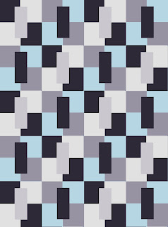
The original tile inspiration:
and, how it works with the colors:
Alright, so for this first one being one of my favorite color palettes so far with the other designs... I kinda hate it here. I am not sure why but it is just not working for me. It made me rethink this design/shape altogether.
Now, when I mocked up this color palette... the design started to grow on me. I do like how it is looking in here...again I think the pop of color really adds something.
I am just not digging this at all. It looks... tired, bleak...yea, just not for me.
I think that this one is almost there... but maybe just not quite.
Now... this one I am really loving! This color scheme with this particular design is really standing out to me!
And again.... just no.
So, that's all the colors with all the inspiration tiles. Now... I think I will narrow it down to one color palette per design and play with them and see the different ways to work it with those colors. Who knew you could play around so much with a shape and a few colors and come up with so many results! Well... I guess all the people that a big name quilters and already know what they are doing...but for someone that is finding their way, this is pretty cool! This process is awesome!
What do you think of these colors for this design?
-Tanyia
Previous posts in this series:
Finding Inspiration: Tile part 1
Finding Inspiration: Tile part 2
Finding Inspiration: Tile part 3
Finding Inspiration: Tile part 4


I like number 2 a lot, but I absolutely love number 5!
ReplyDeleteI love 1 and 3, but like them all!!!!
ReplyDeleteNumber 5 is my favorite. (I seem to like things with a lot of contrast).
ReplyDeleteGood playing. What are you using to play with?